I.Brand Overview
A communications and marketing consultancy based in Canada, founded and led by Theresa Powell. Our work sits at the intersection of strategy and language: more than a decade of industry experience meets a Master's in English Literature, giving us a perspective that is as analytical as it is literary.
We exist to prove that professional doesn't have to mean predictable. Our approach is considered rather than corporate, grounded in research, sharpened by strategy, and expressed through writing that actually sounds like something.
II.Our Tone of Voice
Our voice is professional without being stiff, confident without being cold, and shaped throughout by the belief that good writing is good strategy.
We lead with clarity and purpose, never jargon for its own sake. If a sentence doesn't earn its place, we cut it.
We write like we're speaking to someone we respect, not presenting to a boardroom. Plain language over buzzwords, always.
Every word is chosen deliberately, a reflection of research and craft, not a first draft.
We know our subject, and it shows. Our tone carries authority without needing to prove it.
We sound like ourselves whether we're writing a full strategy deck or a single line of copy.
III.Our Logo Suite
Every logo is available below in both SVG and PNG format, ready to download and use.
Primary Lockup
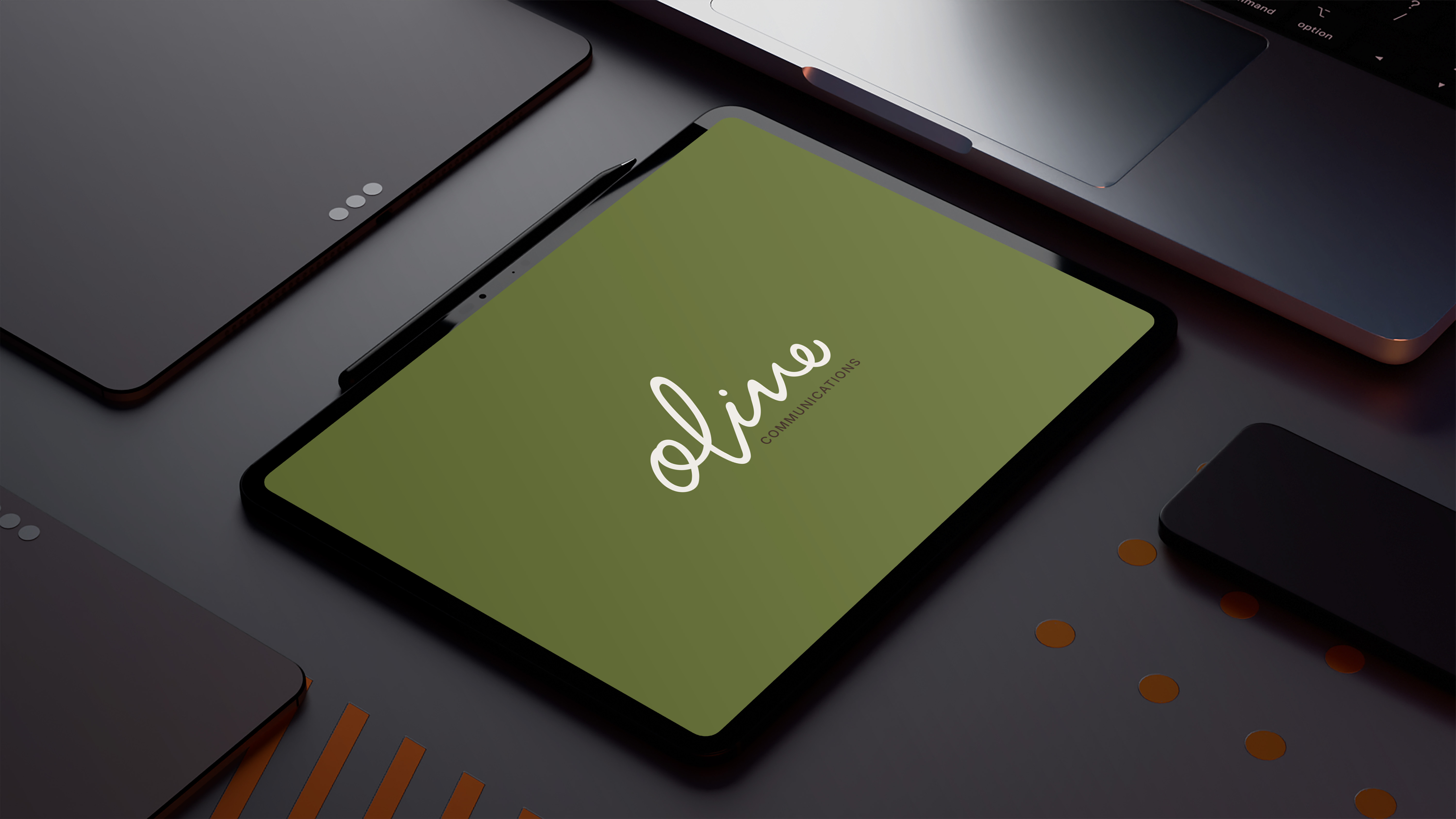
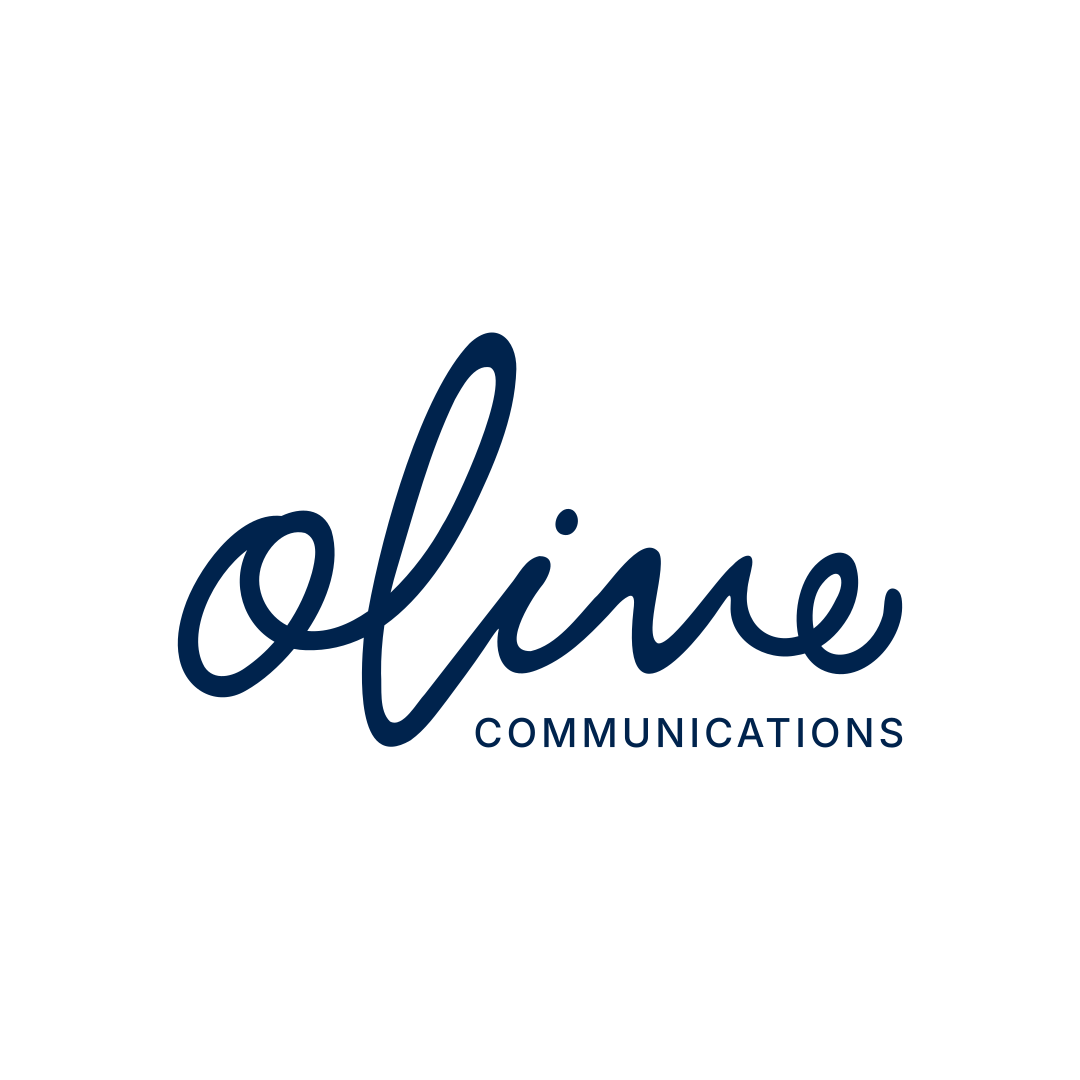
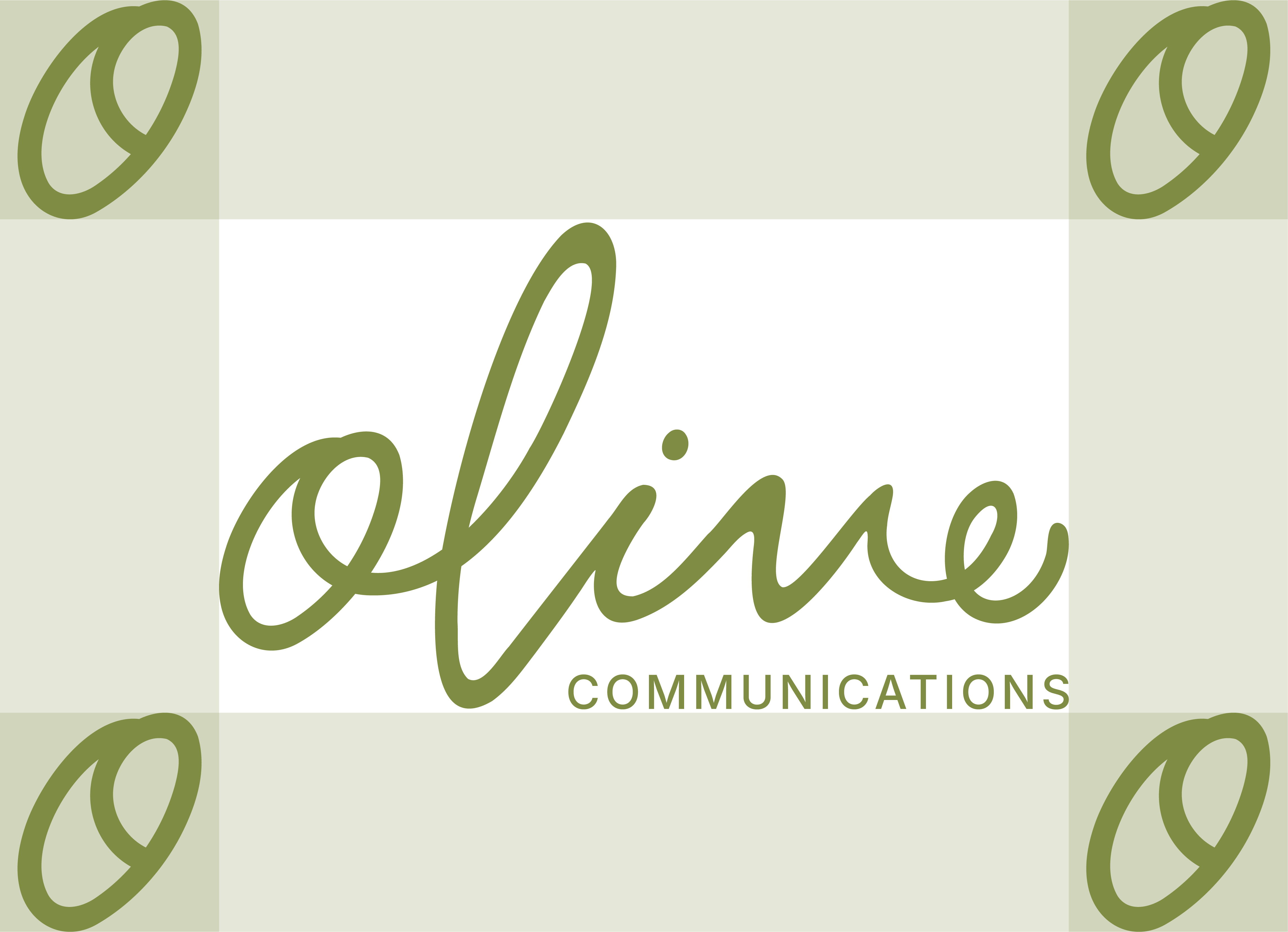
Our primary mark pairs the hand-lettered "olive" wordmark with "Communications" set beneath it in a structured, letterspaced caption. This is our signature, the version we lead with whenever the composition allows for it: headers, title pages, and any application where the full name should read clearly.
Secondary Lockup
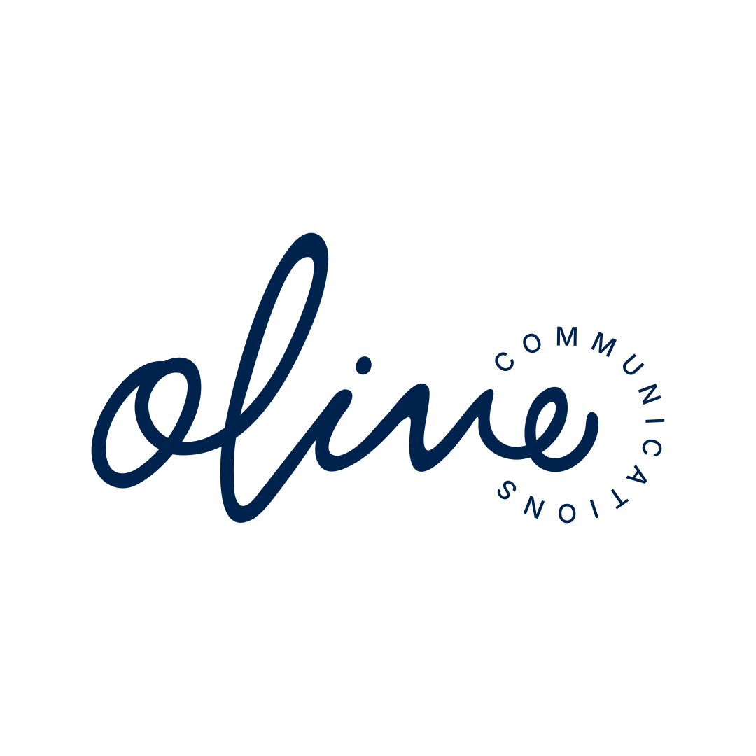
Our name set in a gentle arc, a softer, curved companion to the primary lockup. It suits compositions that call for a circular or badge-like framing without the full containment of our badge mark: digital seals, packaging accents, and social avatars among them.
Standalone Wordmark
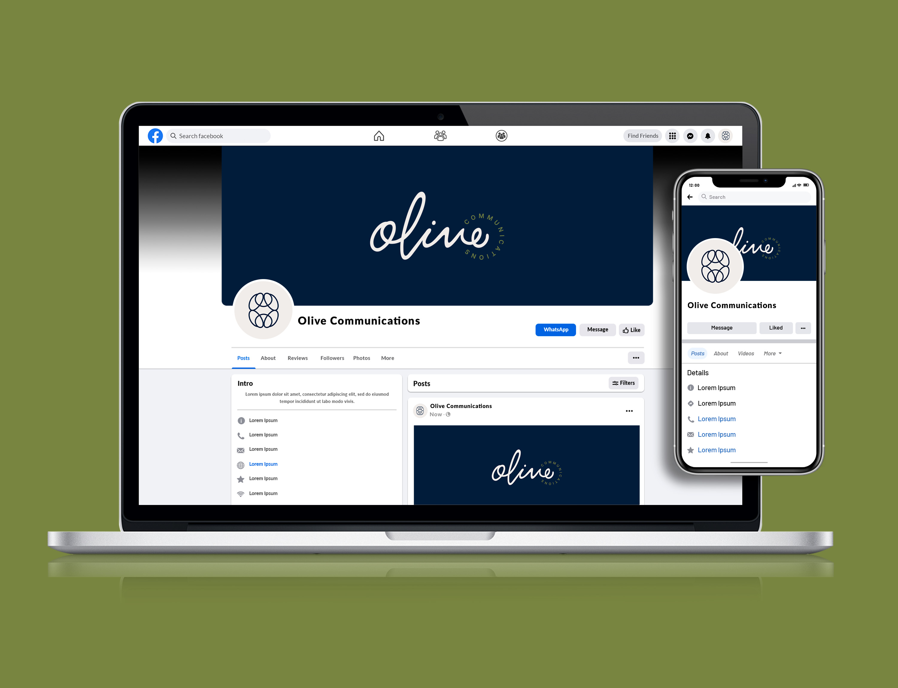
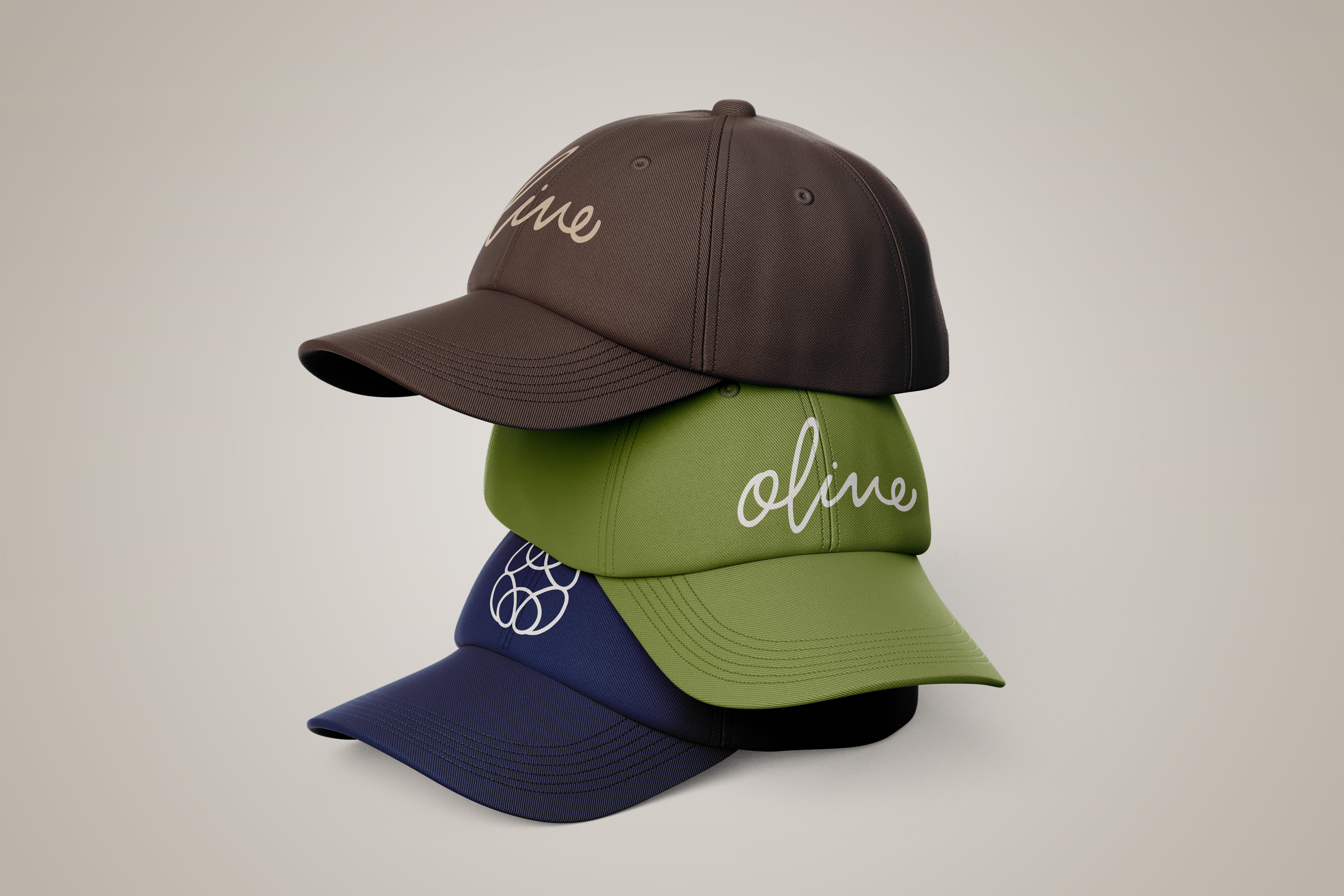
The "olive" wordmark on its own serves as our secondary mark, used wherever the brand has already been introduced or space is limited, our social platforms, merchandise, and app icons among them.
Icon Mark
Our icon is built from the same "O" that anchors the wordmark, repeated and interlocked into a form that echoes an olive. It functions as our most compact identifier, reserved for spaces too small to carry the wordmark, favicons and app tiles among them.
Circular Badge
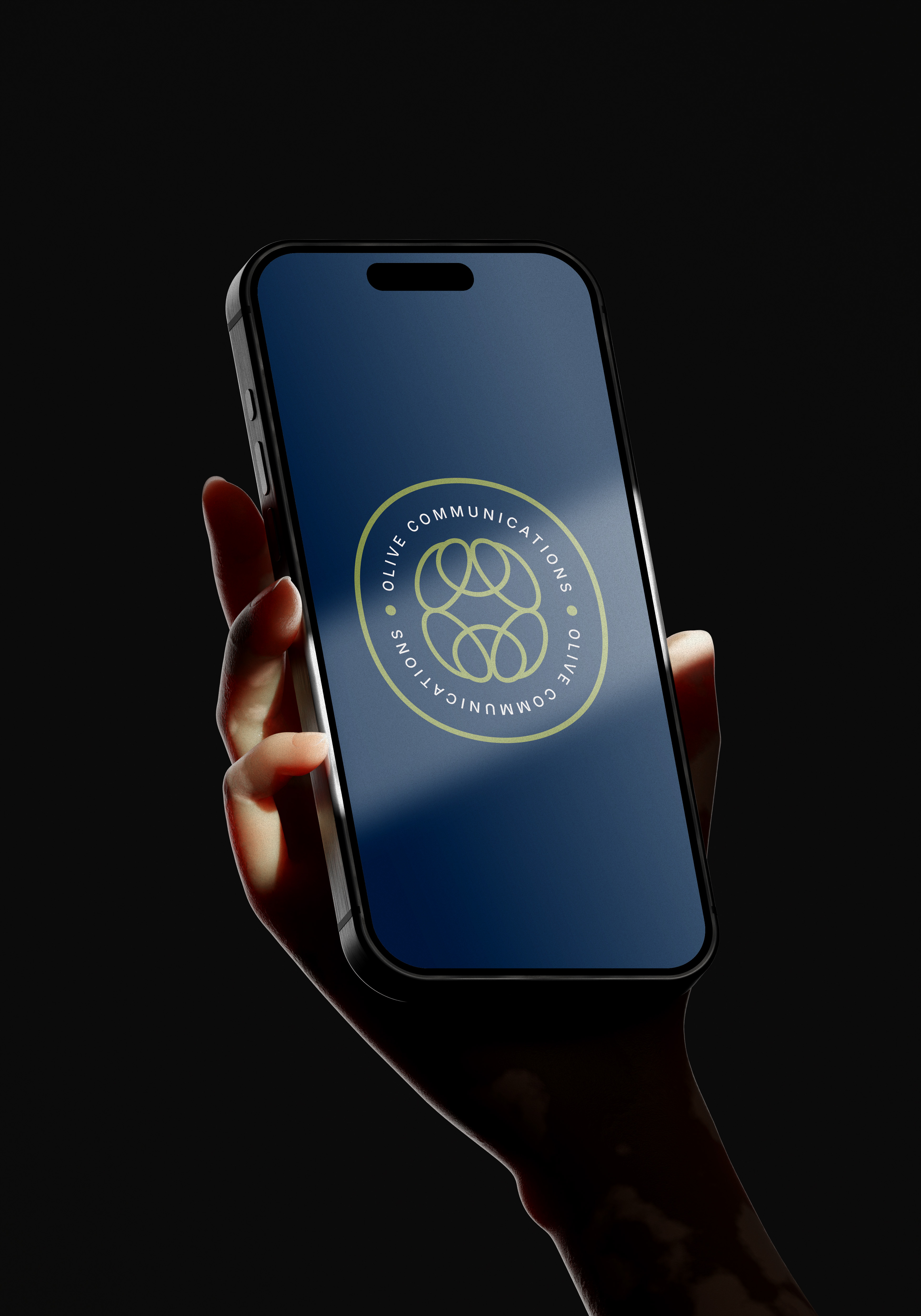
The badge frames our icon within a circular border set with "Olive Communications." It reads as a seal rather than a signature, and suits applications like packaging, stickers, or stamped placements where a self-contained mark is called for.
IV.Clear Space & Minimum Scale
To protect legibility, we maintain clear space around the logo equal to the height of the "O" in "olive," enough room that no competing element crowds the mark. Digitally, the primary lockup should not be reproduced below 100px (or 1 inch in print); below that threshold, the standalone wordmark or icon should be used instead.
Primary Lockup
Secondary Lockup
Standalone Wordmark
V.Logo Do's & Don'ts
Used off-model, that intention gets lost, so here's how we protect it.
Do
Use the supplied files as they are, at their original proportions, in one of our approved single colors, on a background with room and contrast to let the mark read clearly. Choose the lockup suited to the space: Primary when the composition allows it, Standalone or the Icon when it doesn't.
Distorting the proportions throws off the balance of the hand-lettering; the wordmark was drawn at a specific width for a reason.
The mark only ever appears in Navy, Espresso, or Cream. No gradients, no off-palette hues, no multi-color treatments.
If the mark has to compete with a pattern or a close-value color behind it, legibility is already lost.
The mark always sits level. No tilts, no diagonal placements.
No drop shadows, outlines, glows, or bevels. The mark stands on its own.
Respect the clear space rule, equal to the height of the "O" in "olive," on every side.
VI.Our Color Story
Where forest and trail give way to open water. Deep, grounding tones meet warm tan and soft cream, carrying that same sense of rooted land meeting open tide.
Navy and Espresso form the foundation of our palette, carrying the weight of our backgrounds and typography, echoes of deep water and old-growth bark. Olive Green remains our signature accent, the color most closely tied to the brand, while Sand and Cream round out the system as supporting neutrals, drawn from tideline and driftwood, used for balance, contrast, and negative space.
VII.Our Typographic System
Both typefaces are open-source and freely available, including directly on Canva, so the brand stays easy to use and consistent wherever it shows up.
A serif with calligraphic roots, Lora carries warmth and editorial polish. We chose it for the way it bridges structure and craft, a nod to the writing and storytelling at the center of our practice, and to Theresa's background in literature.
A neo-grotesque sans-serif built for on-screen clarity, Inter is precise, modern, and endlessly legible. We chose it to carry the strategic, structural side of our work, everything that needs to read cleanly and confidently, from body copy to interfaces.
VIII.Our Pattern
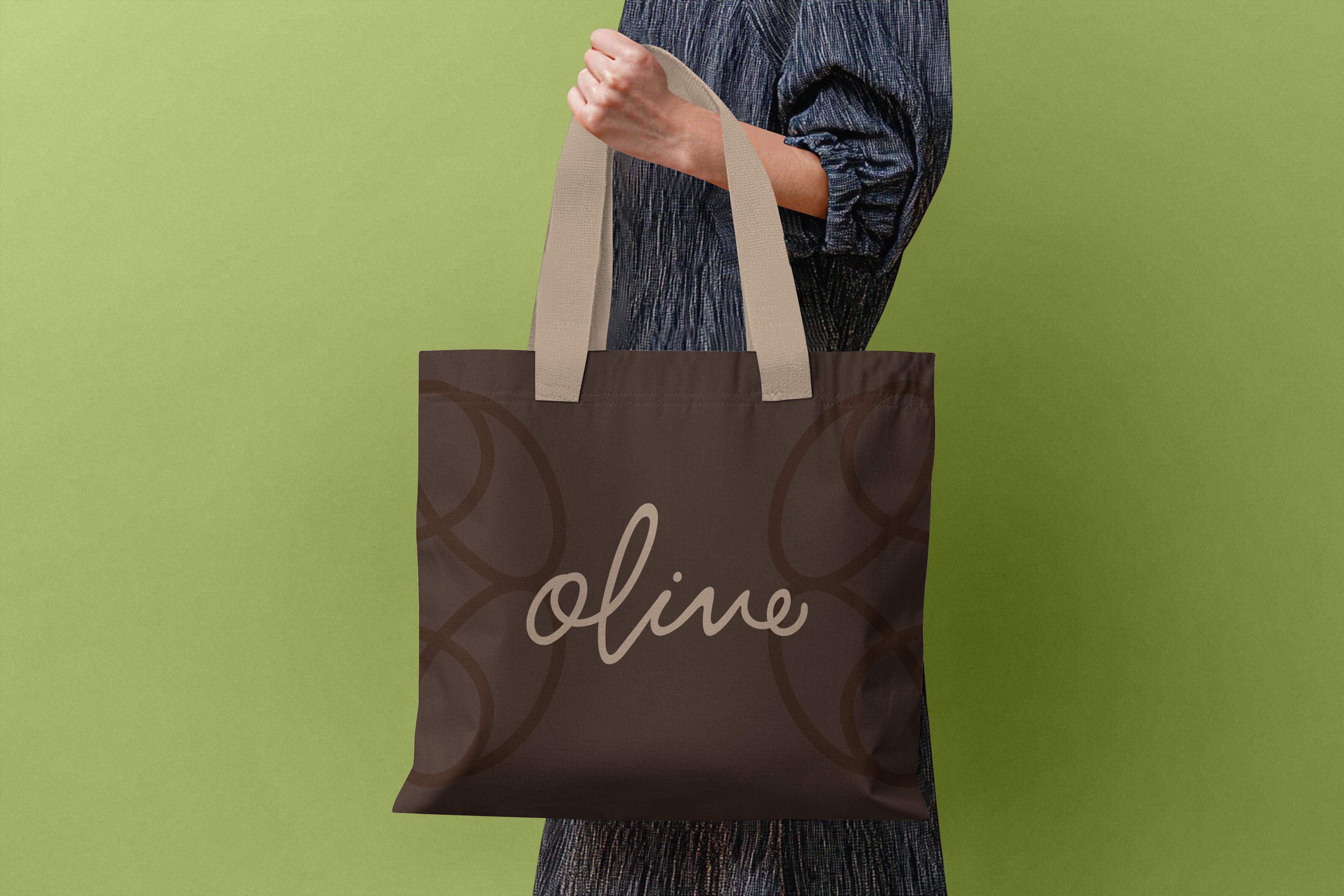
Our pattern extends the same geometry as the icon, repeated into a continuous, interlocking rhythm reminiscent of branches and leaves. It functions as a textural layer across packaging, social templates, stationery, and digital covers, rendered in any color from our palette, adding depth without competing with the logo or type.
IX.The Brand in Use


X.Thank You
We hope these pages leave you with a clear sense of who we are and how we show up, and we're looking forward to a thoughtful, creative, and genuinely fruitful collaboration ahead.
With gratitude,
Olive Communications